
Get Up Lab × Wishlink · Storefront GTM
Wishlink Shop
GTM Launch Campaign
A bright, social-first launch identity for Wishlink's shopping experience. The design system, the motion and the films behind it.
A bright, social-first launch identity for Wishlink's shopping experience. The design system, the motion and the films behind it.


Wishlink Shop turns a creator's profile into a shop. It feels like Instagram, but it's built for buying. My job was to launch it loud.


Where the look came from. Social-first launches, e-commerce hype, editorial type and motion-led storytelling.
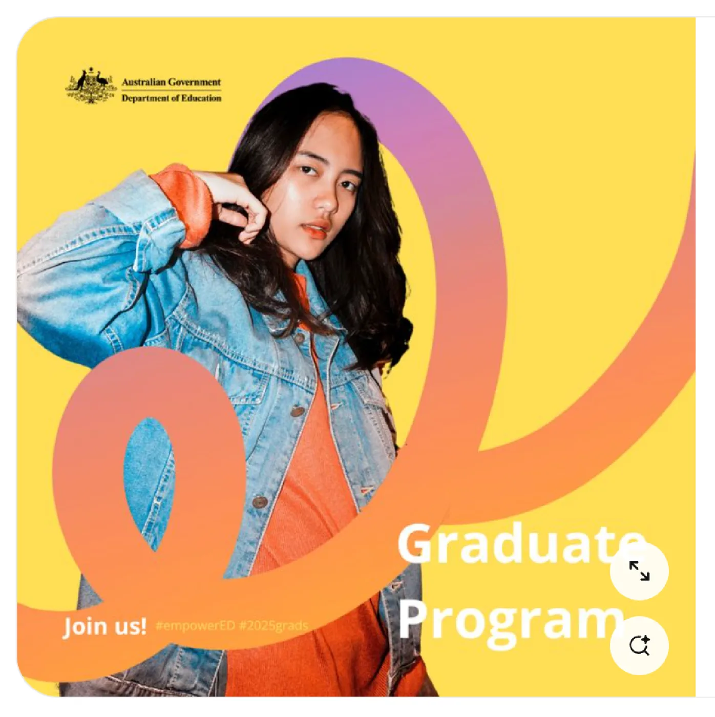
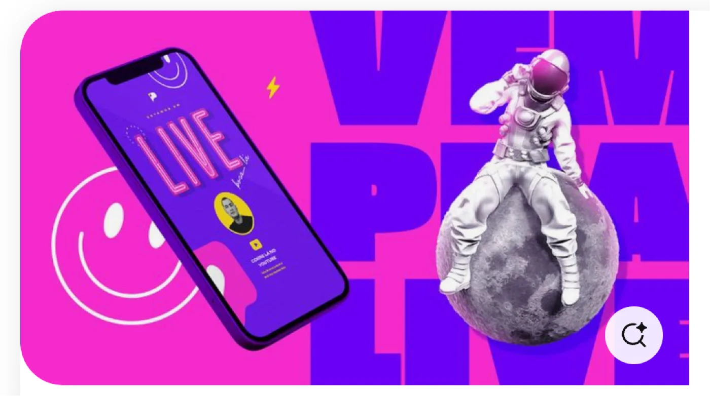
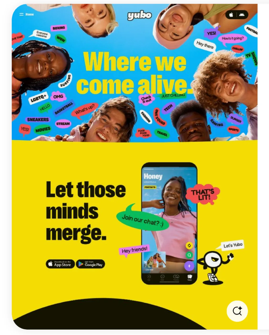
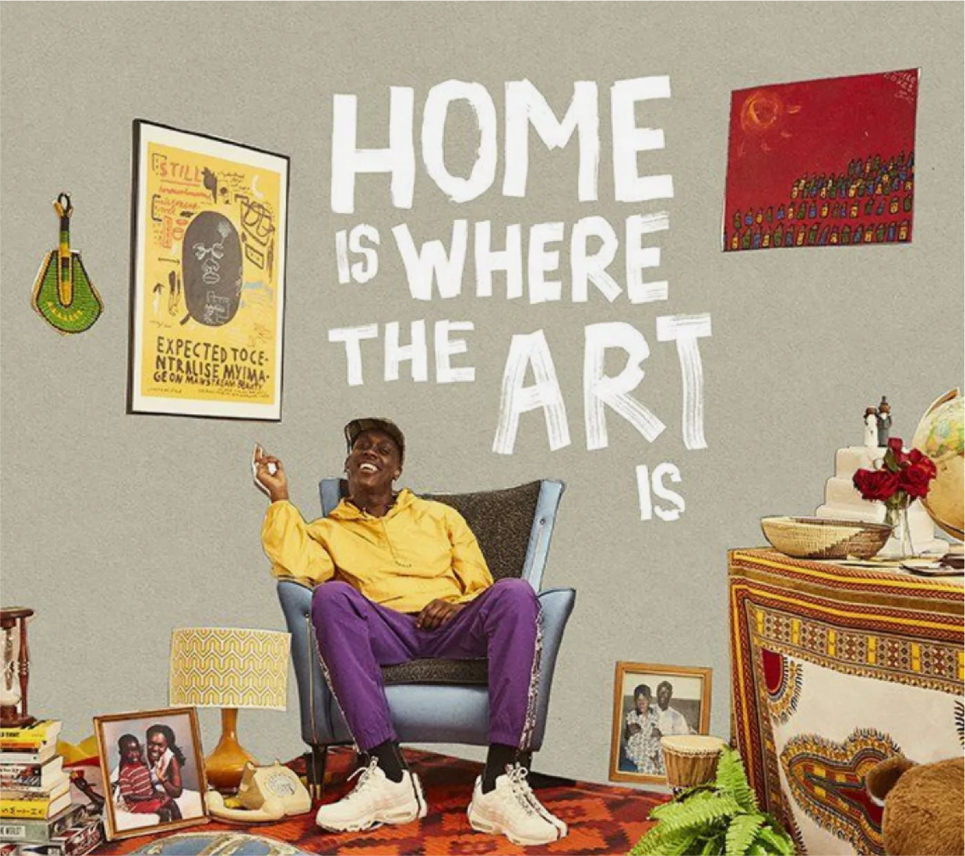
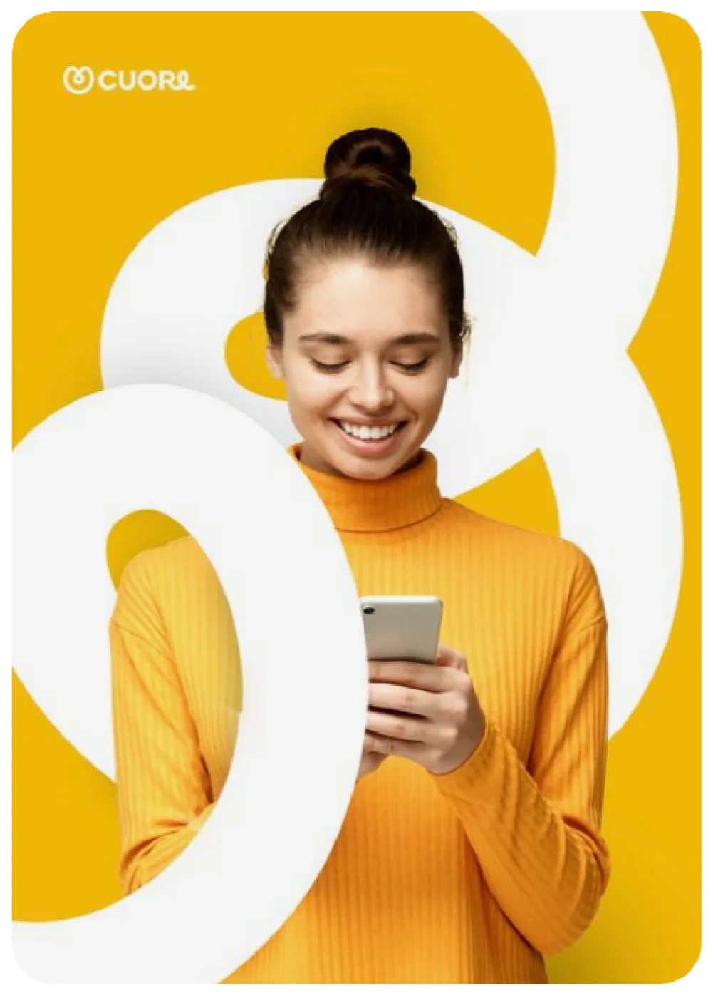
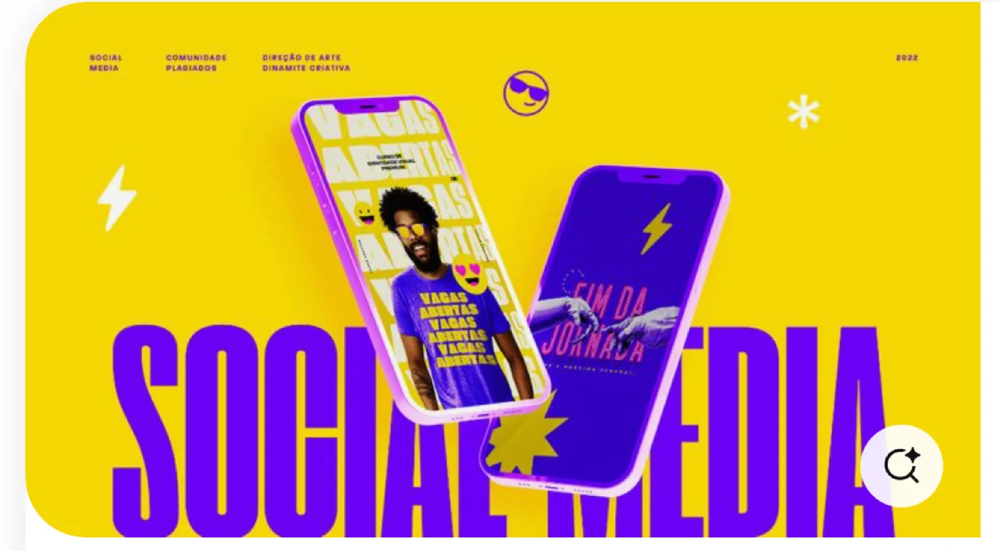
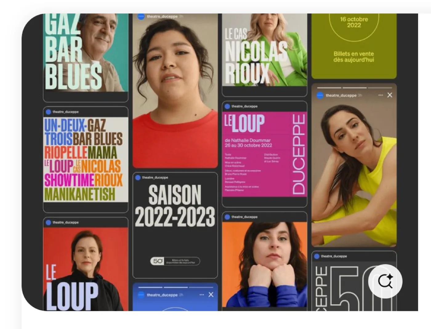
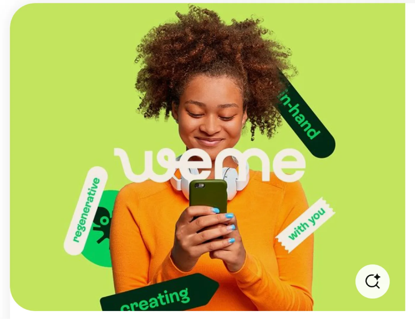
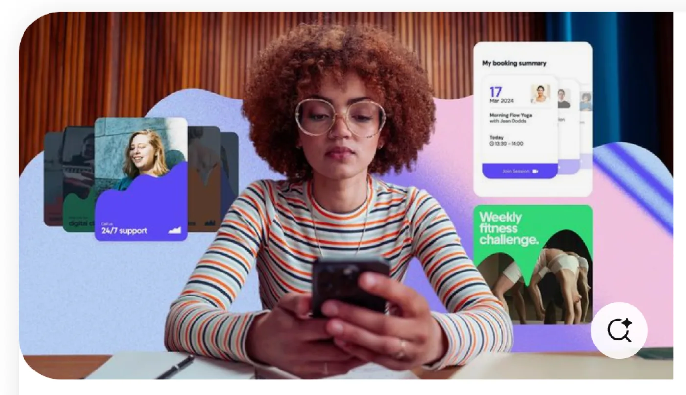
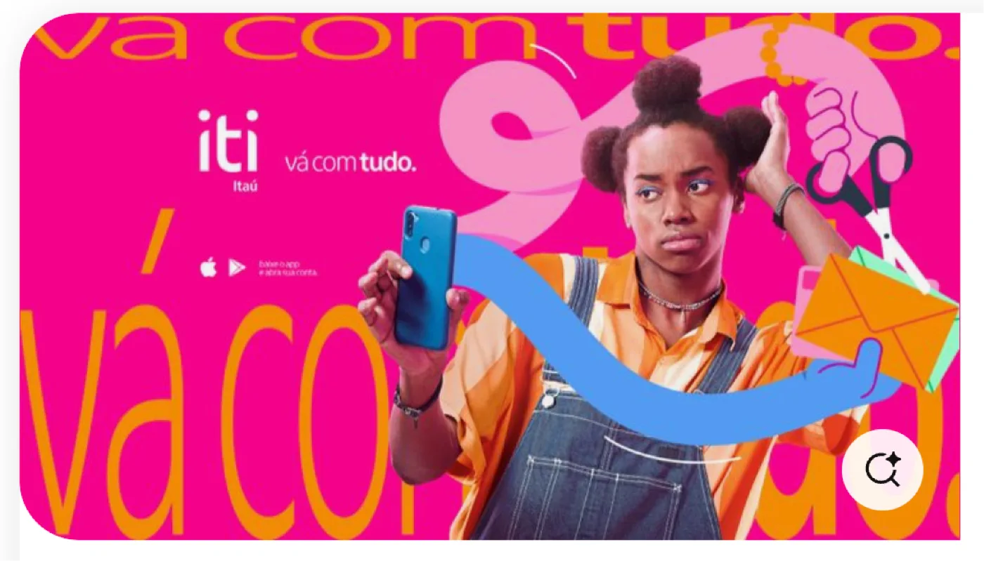
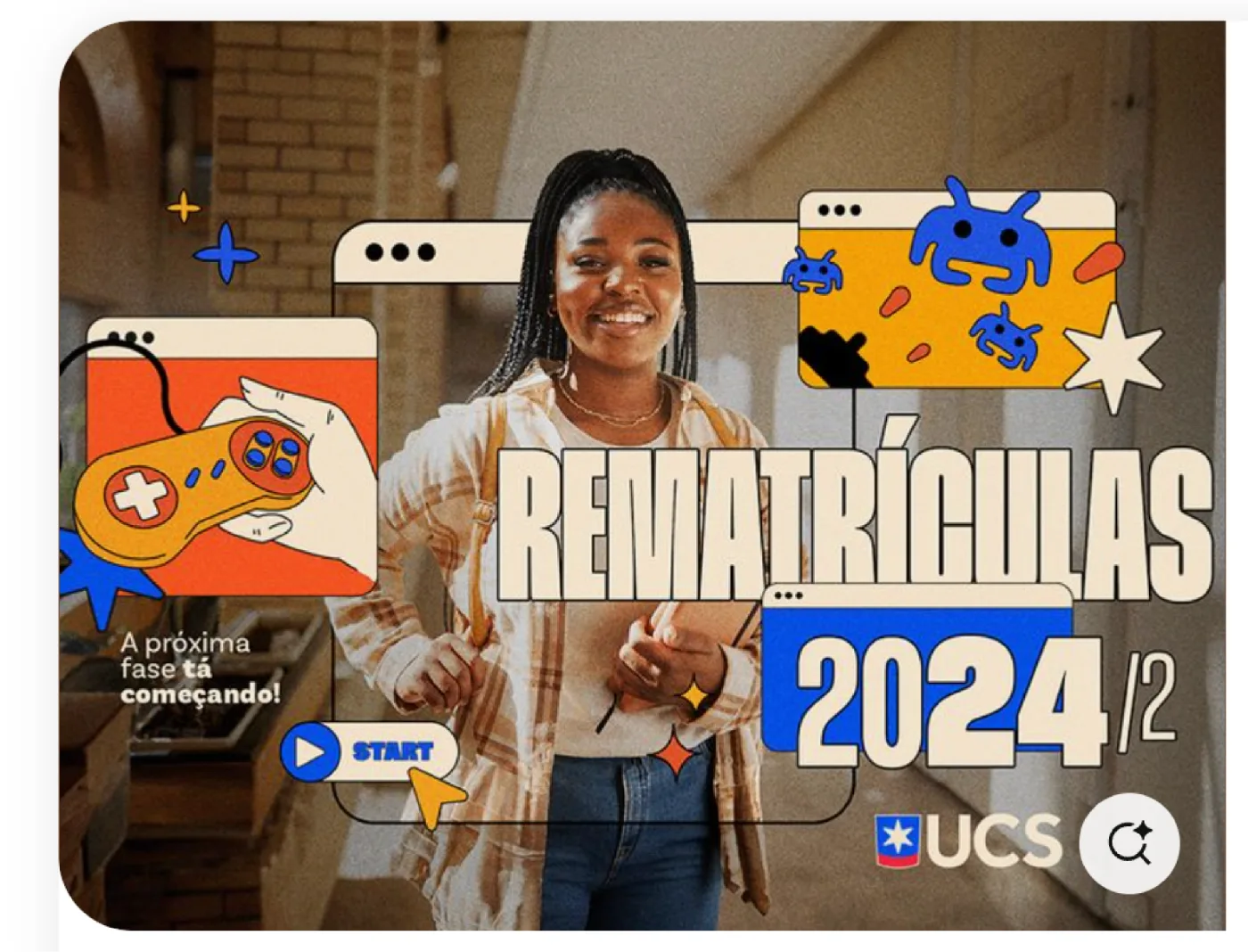



Young, energetic and clearly built for shopping. A personality that feels at home on social and a little cheeky.


Obviously (Narrow) carries every headline, loud and tight. Inter keeps the copy clean and legible.
Every Wishlink employee changed their Instagram bio on the same day, and people noticed. Some cryptic, some cheeky, all making one point. A bio isn't just a placeholder any more.
Inter takes the longer copy, captions and interface labels, set at a comfortable width so it reads clearly against the loud display face.
Obviously shouts the idea. Inter explains it. One loud, one clear.


A palette that pops, then settles. Warm orange leads, cocoa holds it down, peach gives it room, and coral and butter add the spark.


The kit that makes the campaign move. Stars and bursts for energy, arrows and squiggles for direction, eyes and dots for play, all pointing at products and buttons. Hover to play.



 Dot Grid
 AsteriskSunburst
 Spark
Spark Daisy
Daisy TwinkleArrow
 Burst
Burst Puff Star
 ArcsEyes
 Columns
 Squiggle

The same flat shapes become the motion language. They wipe, spin and snap between scenes, turning a still kit into transitions.

One job. Make the tap obvious. A confident set of pills carries the campaign from tease to checkout.

Two formats, one story. A fast reel for the hook, and a longer film to explain and convert.
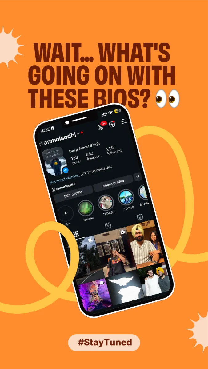 Instagram teaser
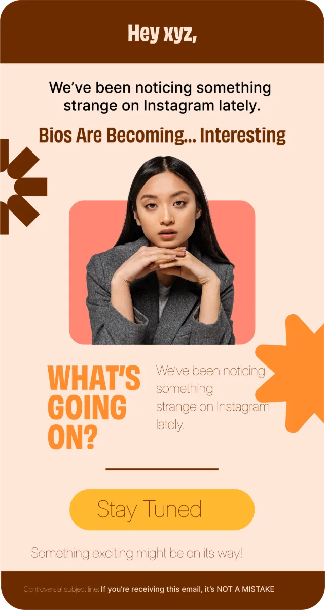 Teaser email

Tease, reveal, convert. One bold, playful system across email, social and video.