Seleqtby Wishlink
A creator-led fashion app for women, kept calm in a category that shouts.
Proven, not fast
Styled, not just sold

project
A calm place to shop what is already working.
Seleqt is Wishlink's creator-led fashion app for women. The category is loud: endless feeds, endless discounts, endless new things nobody has actually worn. The brief was the opposite. Build the app women open when they want to look current, where every trend is proven and every piece comes styled.
I built the whole brand core in one go. Name treatment, wordmark, colour, type, photography direction and the content formats the team ships every week. One rule held it together: purple leads every surface and each accent does exactly one job.
Mature where the category is loud.
Three lines set the tone for everything else. Mature, not loud. Proven, not fast. Styled, not just sold. They decided how big the type could get, how hard the discounts could shout and how much a layout could move.

One lockup, cut in italic display.
The mark is one lockup. Never recoloured, respaced or outlined. Leave clear space on all sides equal to the height of the S, and never go below 180px on screen. White on plum for brand moments, plum on paper everywhere else.
system
Purple anchors, cerulean supports.
An eleven-step plum ramp carries every surface. Cerulean is the second colour, for information, trust and links. Pink, blaze, gold and lime each accent one thing.
Three voices, one publication.
Bricolage Grotesque takes display and headlines. Platypi handles subheads and editorial lines. Lexend does the quiet work in body copy and captions. Nothing else gets in.
Natural light, real women, one hero frame.
Daylight, soft shadows and rooms people actually live in. Aspirational but reachable, never airbrushed. Every story leads with one strong image, so the feed reads like a magazine rather than a catalogue.
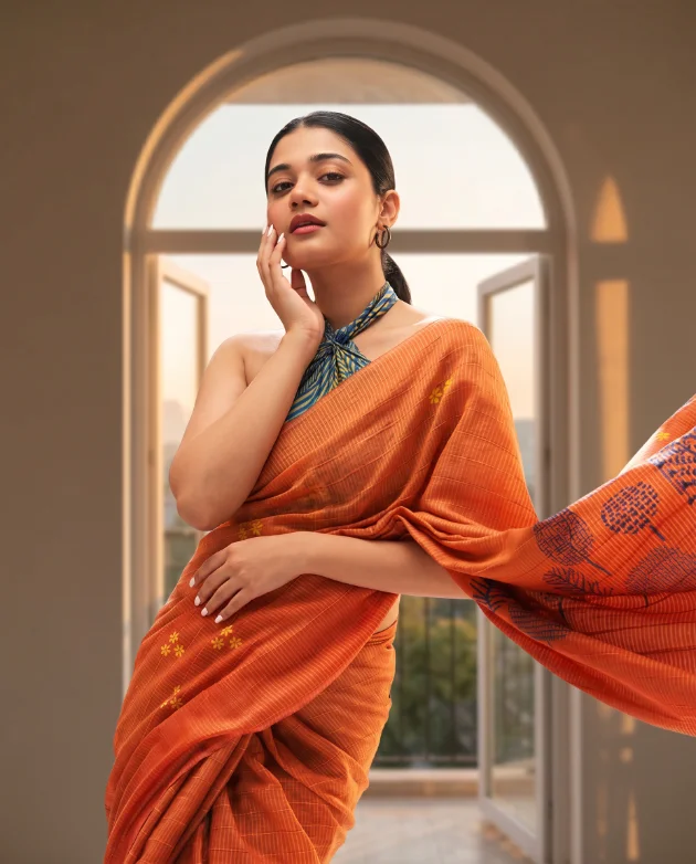
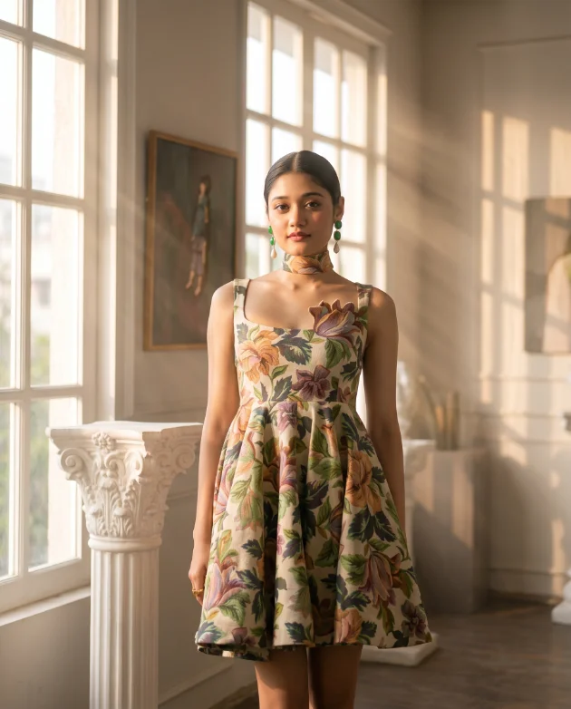

Purple leads. Each accent does one job.Seleqt brand book · colour in application
formats
Templates the team ships every week.
Three formats do most of the work. A trend-alert social post, a weekly edit banner and an offer story. Each uses the same ramp, the same three typefaces and one accent, so a week of content still looks like one brand.
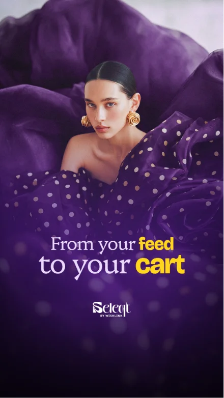
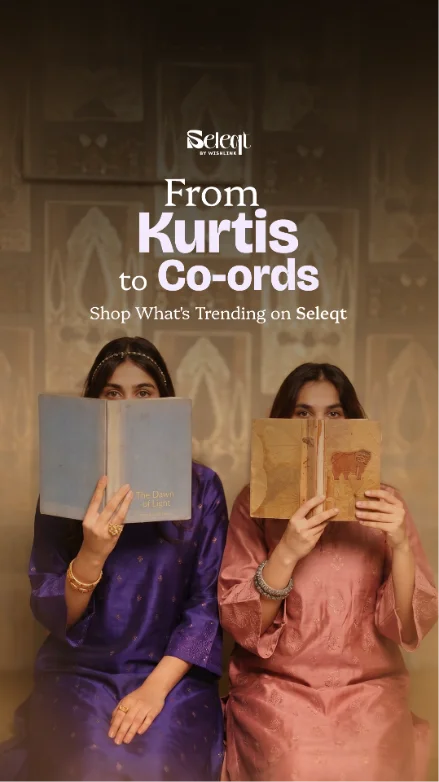
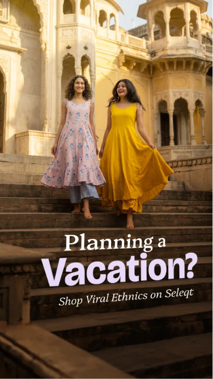
Two seconds of plum, then the feed.
The splash is the only place the wordmark moves. The mark draws itself on, the light warms, and the app takes over. No spinner, no tagline, no version number.
banners
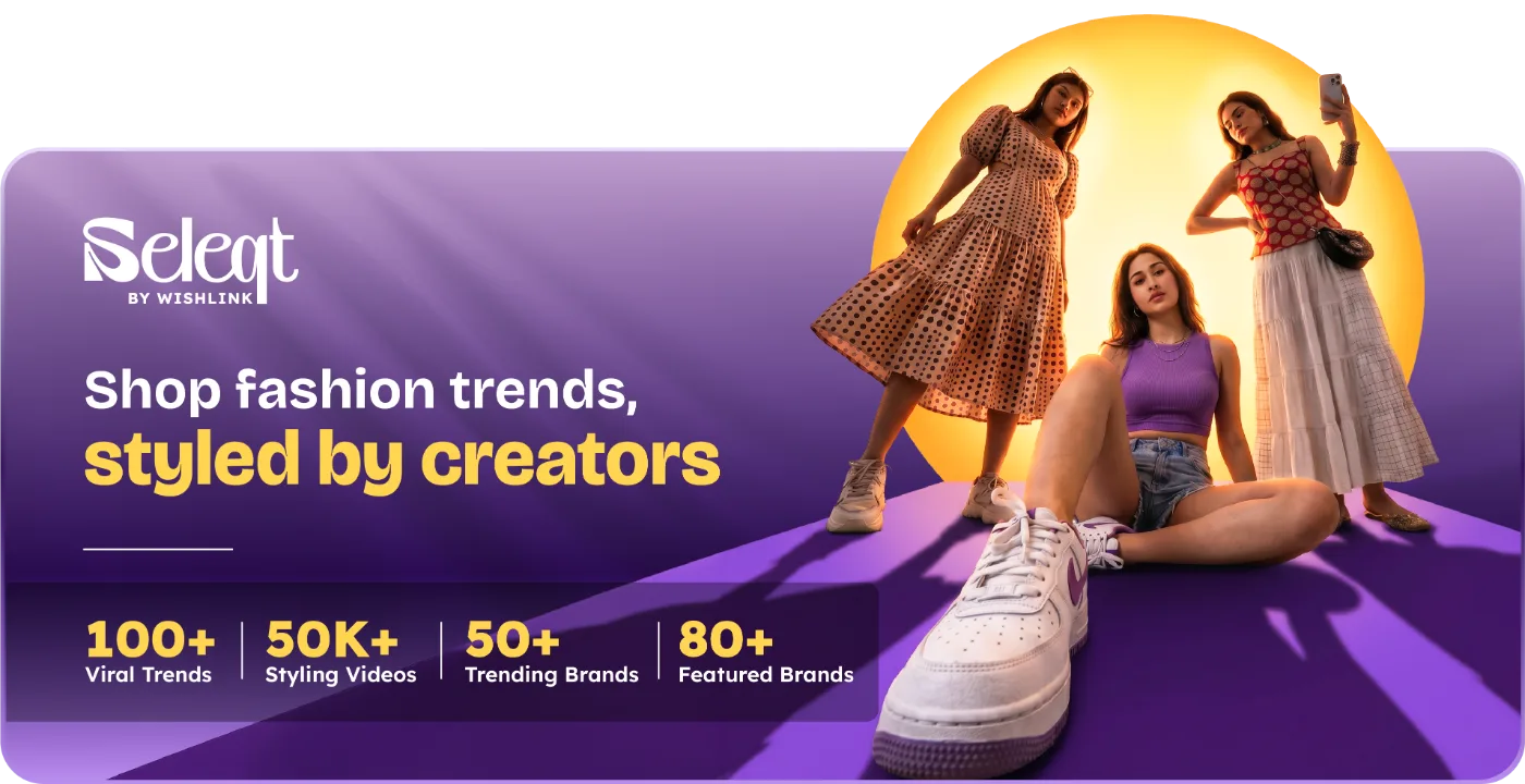
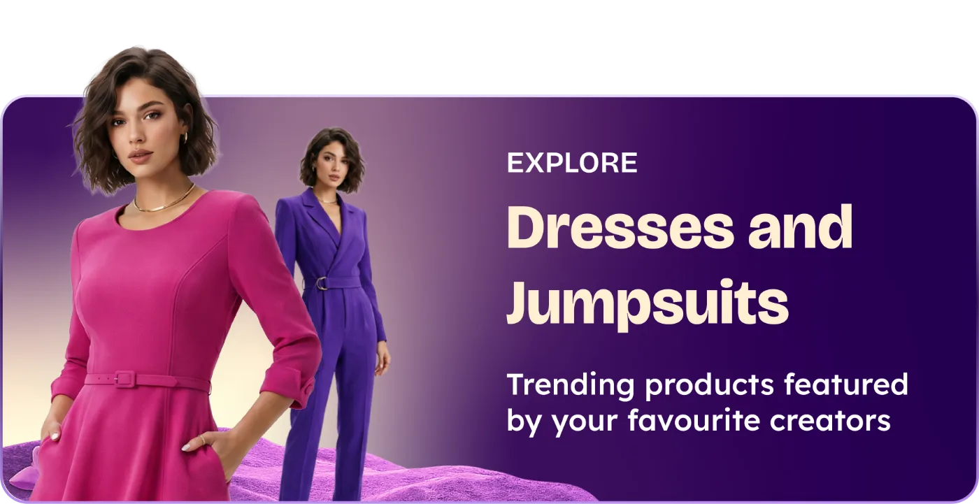
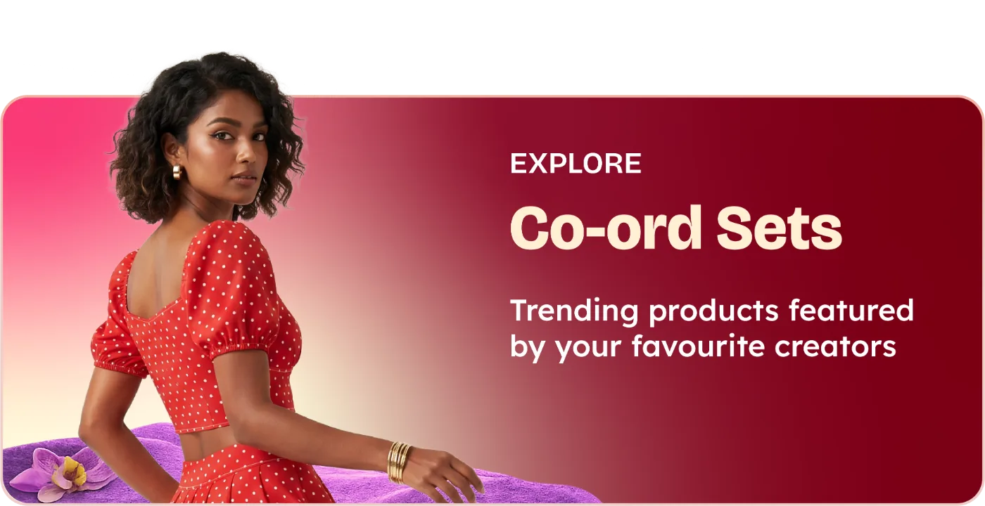
The masthead, then ten categories.
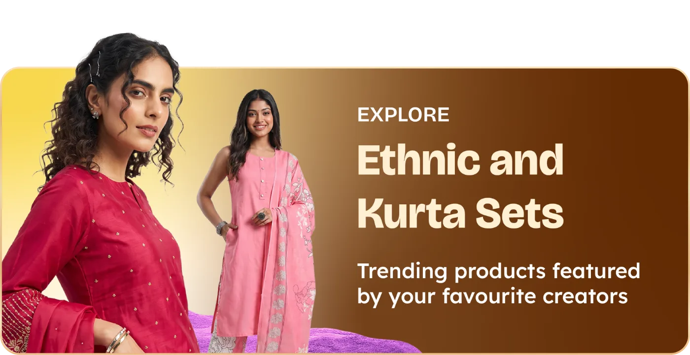
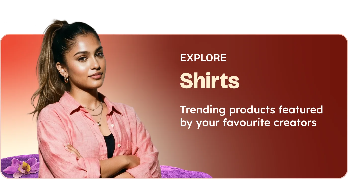
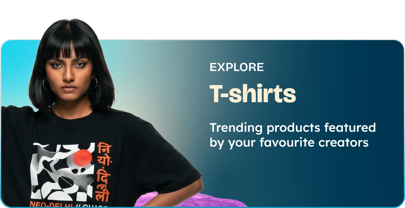
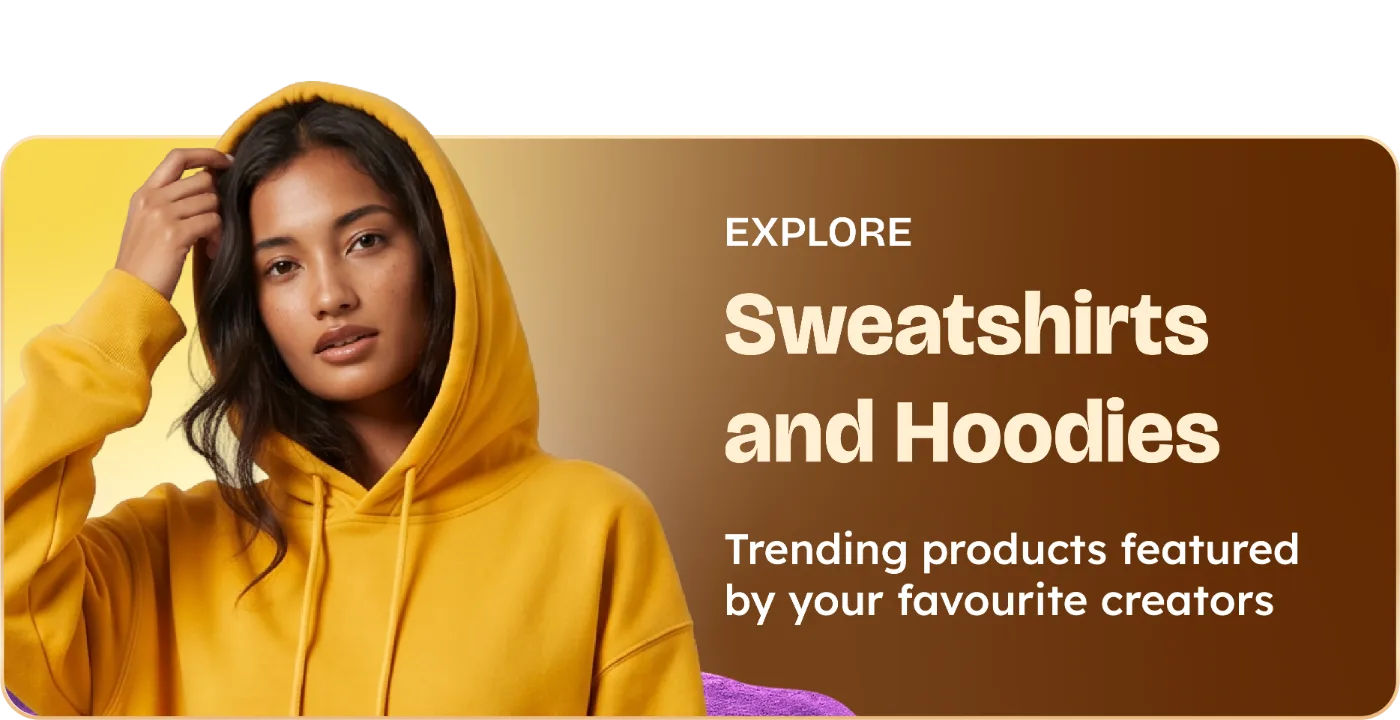
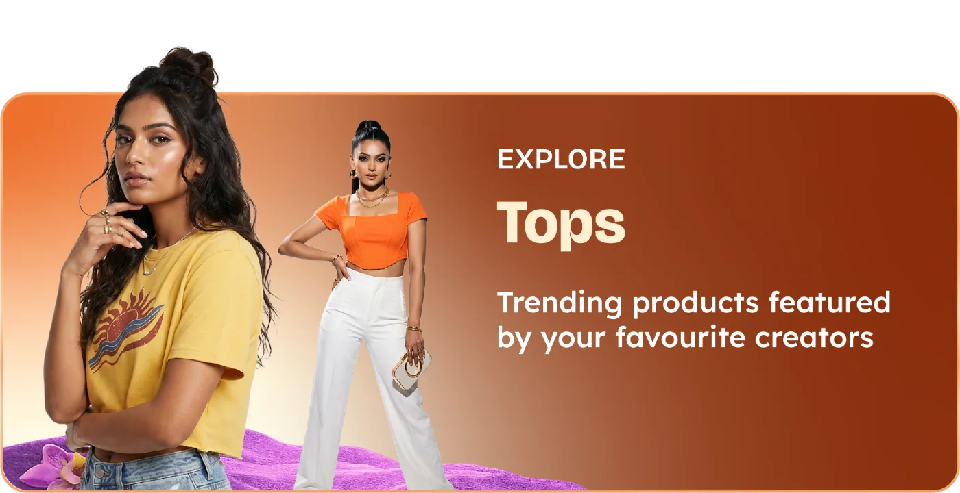
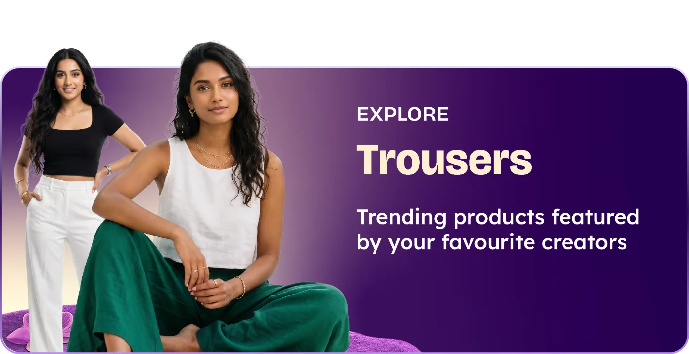
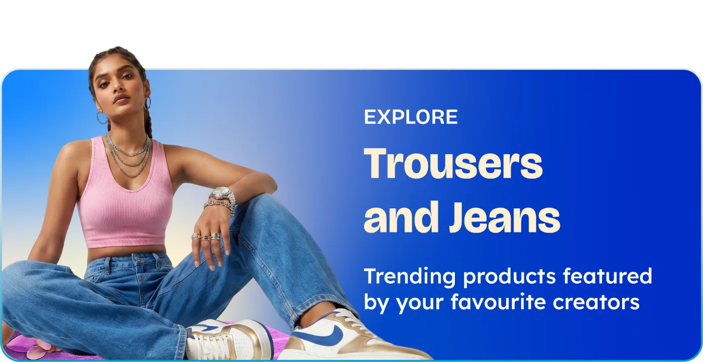
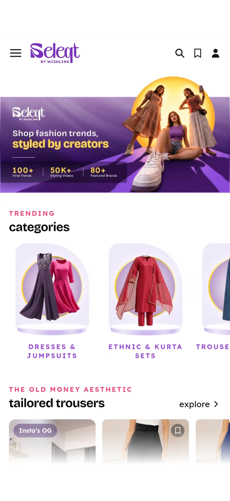
The home masthead carries the wordmark, the promise in two weights and a proof strip along the base. Below it, one banner template per category. Cutouts on the left, an EXPLORE label, the category name in cream, and the same supporting line every time. Only the gradient changes.

tiles
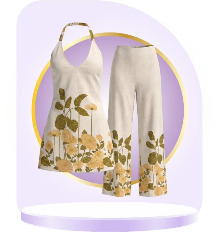
Product on a podium, nothing else.
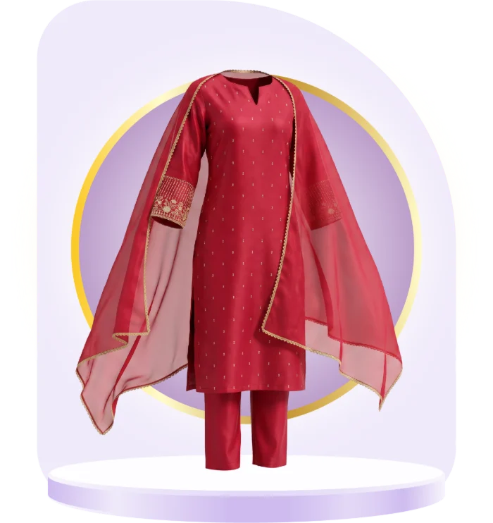
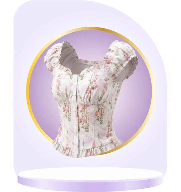
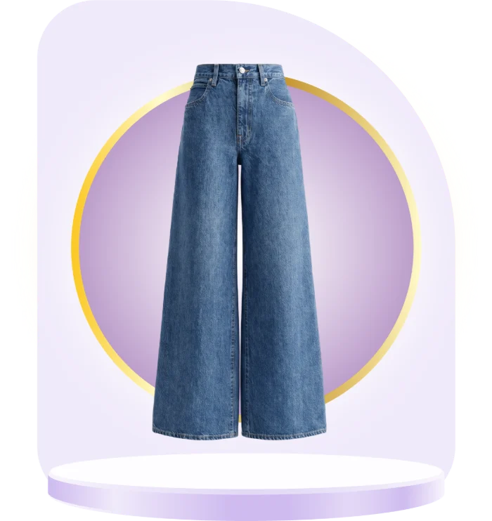
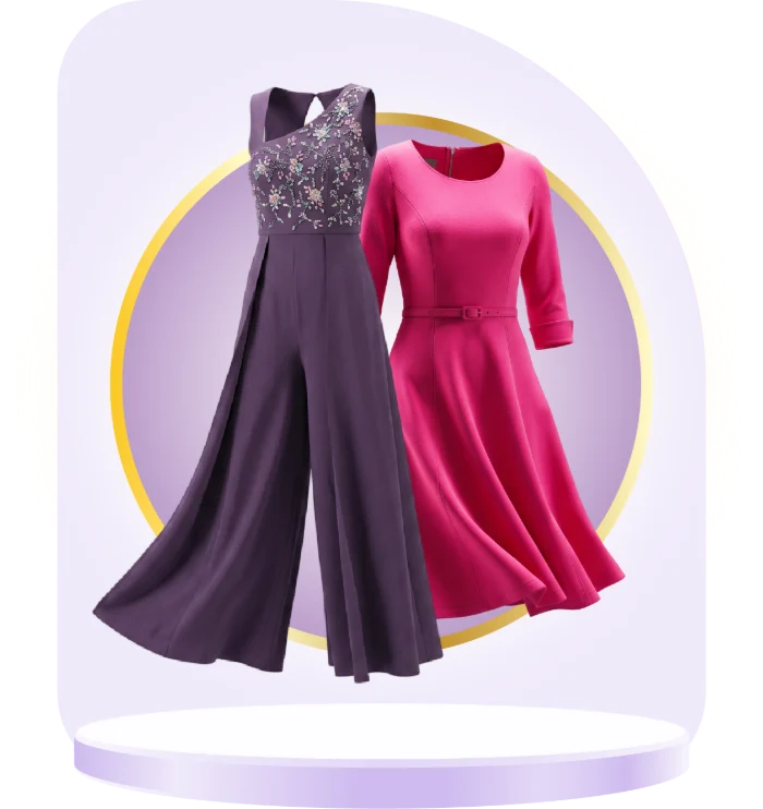
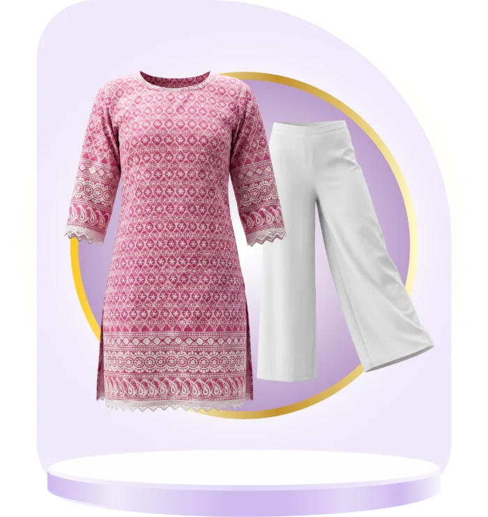
Category tiles drop the models. Each piece sits on a lilac podium with a gold ring behind it and a soft dome above, so a row of tiles reads as one set and only the clothing changes.
in hand
The system, shipped.
Live screens from the app. The masthead banner opens the home feed, the podium tiles run as the category rail, and every price, rating and badge below follows the same accent rules, one job each.
shipped
A brand core the team can run without me.
A wordmark, an eleven-step colour system with a job for each accent, three typefaces, photography rules, colour for UI components and the weekly content formats. All written up and handed to the Seleqt team.